Custom Page Builder
The Custom Page Builder is available when building:
Custom pages can be created and managed from the Manage Custom Pages page. See Manage Custom Pages.
To manage custom pages, go to , and under Cross-Platform Preferences, select Custom Pages.
 Permissions
| PERMISSION NAME | PERMISSION DESCRIPTION | CATEGORY |
| Custom Pages - Manage | Grants access to create and edit custom pages for the portal. This permission cannot be constrained. This is an administrator permission. | Core Administration |
When creating a new custom page, the Configure Layout pop-up opens immediately, enabling administrators to set the initial layout of the custom page, including the number of columns and adding a header and footer row. This pop-up is also available via the Options menu in the Layout Configuration section. See Custom Page Builder - Configure Layout.
The header and page description for the Custom Page Builder can vary depending on the type of page that is being built. For example, for Welcome pages, the header displays the name of the selected Division for which you are creating the Welcome Page, and the page description displays the name of the selected OU or group for which you are creating the custom Welcome Page. If you are creating the Welcome Page for the default division, this is blank.

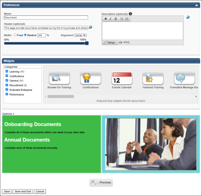
Preferences
In the Preferences section, specify the following information about the custom page:
- Name - Enter a name for the custom page. The name should indicate the purpose of the page so that it is easily recognizable if multiple custom pages exist. The character limit for this field is 100. If multiple languages are enabled for your portal, select the Translate icon to translate the field into other available languages. If no translation is provided for a language, the field appears in the default language of the administrator that last saved the field. Note: Depending on the page that is being built, this field may be optional, required, or hidden. Also, a default value may be set for this field.
- For all Welcome pages, this field is hidden.
- Header - Enter a page header or greeting that appears at the top of the page. This field accepts HTML. If no header is entered, no page header is displayed. The character limit for this field is 100. If multiple languages are enabled for your portal, select the Translate icon to translate the field into other available languages. If no translation is provided for a language, the field appears in the default language of the administrator that last saved the field. Note: Depending on the page that is being built, this field may be optional, required, or hidden. Also, a default value may be set for this field.
- For all Welcome pages, this field is optional.
- Description - Enter a description for the custom page. This field accepts HTML. The description appears at the top of the custom page below the page header. You can use the formatting tools to format the description text. If no header is entered, no page header is displayed. The character limit for this page is 1000. If multiple languages are enabled for your portal, select the Translate icon to translate the field into other available languages. If no translation is provided for a language, then no description is displayed. Note: Depending on the page that is being built, this field may be optional, required, or hidden. Also, a default value may be set for this field.
- For all Welcome pages, this field is optional.
- Width - Using the radio buttons, select whether the page width is Fixed or Relative.
- Relative - When this option is selected, the page width is relative to the width of the page window. When the page window width is expanded, the width of the page contents is expanded. In the Width field, enter the appropriate percentage of the page window that the page contents should fill. You can also select the percentage using the slider control. The default percentage is 100%. The acceptable width values are 50-100%.
- Fixed - When this option is selected, the page width is a specific pixel width, and the page contents do not resize as the page window is increased or decreased. In the Width field, enter the appropriate number of pixels for the page width. You can also select the pixel width using the slider control. The default width is 960 pixels. The accepted values are 600-1920px.
- Alignment - From the drop-down, select whether the custom page contents are aligned to the Left, Right, or Center. The page alignment is Center by default.
Widgets
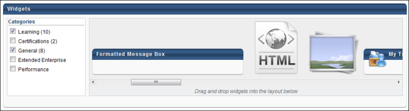
Within the Widgets section, you can select and organize the widgets that should appear on the custom page. Note: Depending on the page that is being built, certain widgets may be initially included in the layout by default. In addition, certain widgets may be required and cannot be removed from the layout.
On the left, all of the available widgets are organized by category. To view the widgets available in a category, select the option box to the left of the category name. Multiple categories can be selected, and all widgets within the selected categories are displayed in alphabetical order in the widget browser to the right of the Categories list. Scroll to the left and to the right within the widget browser to view each available widget. If you deselect a category, the widgets within that category are removed from the widget browser. All categories are selected by default.
To view information about a widget within the widget browser, place the mouse cursor over the Info icon in the upper-right corner of the widget. A pop-up appears with a brief description of the widget.
To add a widget to the custom page, drag and drop the widget from the widget browser to the Layout frame below. When a widget is added to the Layout frame, a preview of the widget is displayed in the Layout frame. You may have to configure the widget before it is displayed in the Layout frame. See Custom Page Builder - Available Widgets. You can then customize the organization and layout of the custom page in the Layout frame. Only one instance of each widget can be added to the page, with the exception of the Image, HTML, and Formatted Message Box widget. Once a widget is placed in the Layout frame (with the exception of the HTML widget), it is no longer available in the widget browser unless it is deleted from the Layout frame.
Layout
The Layout frame enables you to customize the structure of the custom page (number and size of columns and rows). When customizing the structure and layout of the custom page, you should follow the following steps:
- Determine the page structure by separating the layout frame into the appropriate number of rows and columns.
- Resize the cells to fit your needs.
- Arrange the widgets within the cells.
- Customize the widget settings for each widget.
By default, the Layout is configured via the Configure Layout pop-up when the page is initially created. The page can be reconfigured if necessary by selecting the Configure Layout option from the Options drop-down list. See Custom Page Builder - Configure Layout.
The page layout can be reset by selecting the Reset option from the Options drop-down list. This undoes all changes that were made to the page after the most recent Save operation. See Custom Page Builder - Configure Layout.
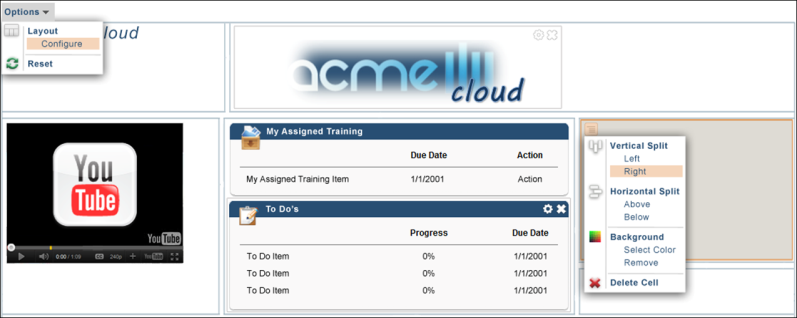
In addition to setting the general page layout via the Options drop-down list, administrators can further configure the layout using the cell menu. To do this, move the mouse cursor over the upper-left corner of a cell to view the Cell Menu icon. Click the Cell Menu icon to view the cell menu options. Note: The Cell Menu is available for all cells in the Layout. The following options appear:
- Vertical Split - The vertical split options add an additional column to the cell. The direction that is selected is the direction in which the existing column is shifted. Note: Depending on the page that is being built, this option may be disabled.
- Left - This option creates an additional column and shifts the contents of the current cell to the right of the new column.
- Right - This option creates an additional column and shifts the contents of the current cell to the left of the new column.
- Horizontal Split - The horizontal split options add an additional row to the cell. The direction that is selected is the direction in which the existing row is shifted. Note: Depending on the page that is being built, this option may be disabled.
- Above - This option creates an additional row and shifts the contents of the current cell below the new row.
- Below - This option creates an additional row and shifts the contents of the current cell above the new row.
- Background Color - This option enables you to set the background color for the cell. The Select Color pop-up opens, where you can either select a color from the grid or enter the Hex Value for the desired color. Note: Depending on the page that is being built, this option may be disabled. Also, a default value may be set.
- Delete Cell - This deletes the cell along with the contents of the cell. Any widgets that were in the deleted cell must be re-added to the layout if necessary. Any cell can be deleted except for the last cell. Note: Depending on the page that is being built, this option may be disabled.
Once all of the columns and rows are added, you can resize the cells by clicking the edges of the cells and dragging them to the appropriate size. Cells can be resized both vertically and horizontally. Note: Depending on the page that is being built, the ability to resize cells may be disabled.
After setting the columns and rows to the appropriate size, you can arrange the widgets within the cells as necessary by dragging and dropping them into the appropriate cell. You can also dictate the order in which the widgets appear by dragging and dropping the widgets within the cell.
Lastly, after the page is formatted as desired and the widgets are in place, you can customize the widget settings, including the widget title and the number of items that appear in the widget. To set the widget settings, move the mouse cursor over the upper-right corner of the widget to view the Settings icon. Click the Settings icon to view the widget settings pop-up. See Custom Page Builder - Available Widgets.
To delete a widget from a cell, move your mouse cursor over the upper-right corner of the widget and click the Delete icon. The widget can be re-added to the layout if necessary by dragging and dropping it from the widget browser into the appropriate cell. Note: Depending on the page that is being built, certain widgets may be required and cannot be removed from the layout.
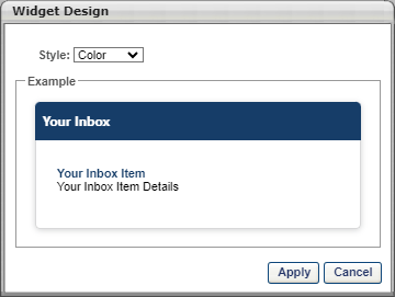
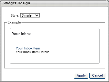
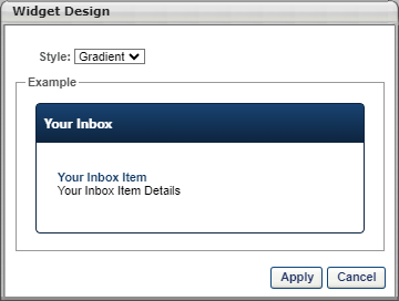
Enhanced Widget Design Options
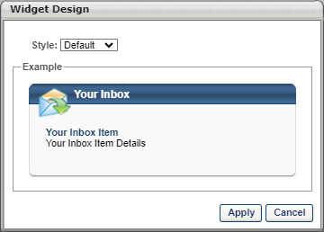
For portals with enhanced widget design options enabled, you can also define the widget style. A Design option is available from the Options drop-down, which enables you to select from the following widget styles:
- Color - The Color widget design displays with a single-color heading bar. The widget design will retain the corporate colors. Specific color changes for the widget cannot be designed within the widget. This design does not display the widget icons.
- Simple - The Simple widget design displays with a white background for the heading bar. This design does not display the widget icons.
- Gradient - The Gradient widget design displays with a gradient-colored heading bar and a single-color border. The widget design will retain the corporate colors. Specific color changes for the widget cannot be designed within the widget. This design does not display the widget icons.
- Default - The Default style is the existing standard widget design. If the enhanced widget designs feature is enabled, but a widget design has not been selected, then the Default style is automatically selected. The Default style can be modified by selecting one of the new widget styles from the Style drop-down.
Affected Widgets
The following widgets can be configured with the enhanced widget designs:
- Browse for Training
- Certifications
- Formatted Message Box
- My Certifications/Designations/CE
- My Training
- Online Training in Progress
- Order Forms
- Pending Evaluations
- Required Training
- Suggested Training
- To Do's
- Training in Progress
- Training Progress Pie Chart
- Training Status Summary
- Your Action Items
- Your Assigned Training
- Your Inbox
- Your Interest & Waitlist Tracking
- Your Tasks
- Your Upcoming Sessions
Clicking the Design option opens the Widget Design pop-up. The widget styles appear in the Style drop-down. For each design, a sample widget displays to show the design.
Once the design is selected, click in the pop-up to apply the design. The selected design applies to all widgets on the page. A separate design cannot be selected for individual widgets.
Note: The design options only display if enabled by a backend setting that is disabled by default. To enable this functionality, contact Global Customer Support.
Preview and Save
To preview the custom page, click the button at the bottom of the page. This renders the custom page in a new window as it is currently designed in the Layout frame. All widgets include "Preview" content that is not specific to your portal.
After creating the custom page, click one of the following options:
- to save your changes made during the session and remain on the page.
- to save the changes made during the session and return to the previous page. This option is only available for custom pages and Welcome pages, where the page designer is not opened in a pop-up. This returns the admin to the Welcome Page Preferences page. See Welcome Page Preferences - Custom Page Builder.
Once the page is created, it can be added to the navigation tabs and links so that your system users can access and utilize the page. See Navigational Tabs and Links.

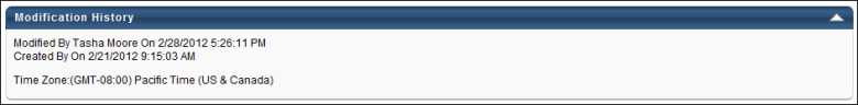
Modification History
The Modification History tracks each time a page is created and modified, as well as the creator or modifier and the corresponding time and date stamp.