The Chart panel on the Builder page lets you create charts in order to display data visually. Charting lets you create pie, line, bar, and column charts that can be exported as images. You can also define the X and Y axis of the chart by using the Summarize by and Measure fields.
To access Reporting 2.0, go to
For more information about Reporting 2.0 permissions, see the following:
- Permissions in Reporting 2.0 - This provides detailed information about Reporting 2.0 permissions.
- Permissions List - This provides the list of permissions and their relationships so that you know which permissions users need to have to create and view reports.
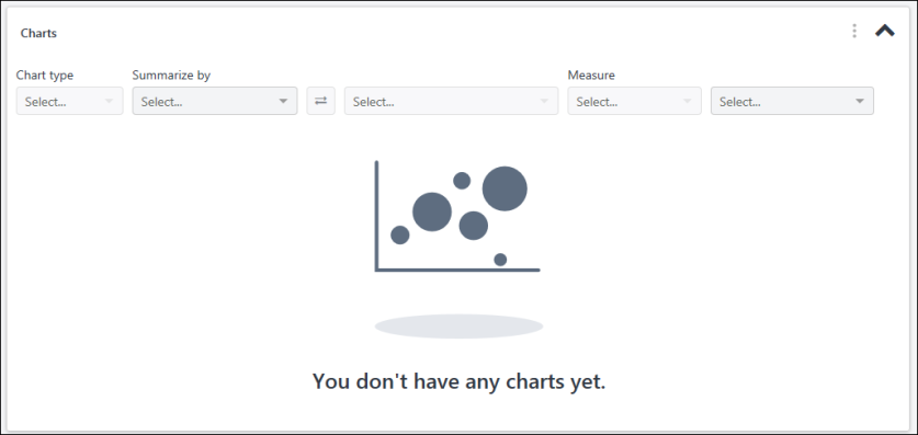
Multiple chart types are supported in the chart designer. The type of chart that can be created depends on the combination of fields that are added as dimensions (via the Summarize by field) and as the measure. The Chart Type drop-down is grayed out and not selectable until dimensions and measures are added to the chart.
The following chart types are supported:
- Bar - This chart type displays as horizontal bars and compares multiple values with each other.
- Column - This chart type displays as vertical lines and compares values across a range.
- Line - This chart type displays as a line graph and shows trending over time.
- Pie - This chart type displays as a pie chart and compares proportions of data and how they contribute to a whole. Note: Pie charts may reflect an 'Other' section. This is a collection of pie slices that are less than 1%. When there are many slices below 1%, the slices are collected into one pie slice so that the labels do not overlap.
Once dimensions and measures are added for the chart, the chart type is selected automatically. If a different chart type is available based on the combination of fields, then you can select a different chart type from the drop-down.
Each chart type has a recommended set of field types that can be added as summarization and measure fields. Although the Builder will not prevent you from using any field type combinations for creating charts, the field combinations specified in the table below are the suggested field combinations for specific chart types.
Note about Pie Charts: Pie charts can only be generated with a first level summary. If two summarization fields are added to a chart, a pie chart will not be available as a chart option in the chart type drop-down. Small slices of data of less than 1% will be grouped into an "Other" category.
Note about Date Fields: The date format in the chart is based on the user's culture, which matches the report output.
| Field Type Selected as First Summary | Field Type Selected as Second Summary | Field Type Selected as Measure | Legend | Default Chart | Recommended Chart Types |
|---|---|---|---|---|---|
| Date | N/A |
Numeric Field: SUM, Average, MIN, MAX String Field: Count, Count Distinct |
No Legend | Column | Column, Line, Side Bar |
| Date | Numeric |
Numeric Field: SUM, Average, MIN, MAX String Field: Count, Count Distinct |
Second Summary Field | Column | Line |
| Date | Text or Yes/No |
Numeric Field: SUM, Average, MIN, MAX String Field: Count, Count Distinct |
Second Summary Field | Column | Column, Line, Side Bar |
| Numeric | N/A |
Numeric Field: SUM, Average, MIN, MAX String Field: Count, Count Distinct Note: Summary and Measure Fields can be the same field. |
First Summary Field | Pie | Pie |
| Text or Yes/No | N/A |
Numeric Field: SUM, Average, MIN, MAX String Field: Count, Count Distinct |
First Summary Field | Column |
Column, Pie, Side Bar |
| Text or Yes/No | Text or Yes/No |
Numeric Field: SUM, Average, MIN, MAX String Field: Count, Count Distinct |
Second Summary Field | Column | Column, Side Bar |
The Summarize by field is used to define the dimensions for the chart, which display as the X axis. The dimensions are the fields that summarize the chart. Up to two dimensions can be included in the chart. Any field type can be added to the Summarize by field.
To add dimensions:
- Click and drag a column from the Table Columns panel to the Summarize by field. Or,
- Search for and select a dimension in the Summarize by field.
- Follow the above steps to select a second dimension.
The swap button ![]() , which is located between the two dimensions, will swap the order of the dimensions in the chart. This option is available when there are two string field types added as dimensions.
, which is located between the two dimensions, will swap the order of the dimensions in the chart. This option is available when there are two string field types added as dimensions.
When summarizing by date fields, additional summary options are available. A calendar icon appears to the right of the Summarize by field and includes the following additional summary options:
- Day
- Month
- Year
- Calendar Quarter
- Calendar Year
Note about Date Fields: The date format in the chart is based on the user's culture, which matches the report output.
A measure is any string or numeric field that can be measured. The measure is the Y axis of the chart. The Measure option is grayed out and not selectable until at least one dimension is added. Date and Boolean fields cannot be used as measures.
To add a measure:
- Click and drag a column from the Table Columns panel to the second box in the Measure field. Or,
- Search for and select a measure in the second box of the Measure field.
The first drop-down in the Measure field displays the aggregates. An aggregate is automatically defined by the system when selecting the field to measure, depending on the field type added to the measure option.
You can change the aggregate if a different aggregate is available for the measure.
The maximum aggregation is 200,000 records.
The following aggregates apply to each field type:
Chart Options
The following options are available in the Chart Options kabob menu:
This option lets you show/hide the plot point labels in the chart. The labels display as follows for each report type:
- Pie - The labels display the name, count, and percentage for each pie slice.
- Column - The labels display the count for each bar.
- Line - The labels display the count at each data point in the line.
- Bar - The labels display the count for each side bar.
This option lets you remove the chart from your report.
This option is helpful when the legend takes up too much space on the chart viewer, and you would like to show only the data on the chart. When the legend is hidden or shown, the selection is also reflected when the chart is downloaded. For Column, Bar, and Line charts this option is only available when a chart has more than one dimension. For Pie charts this option is always available.
This option lets you customize the colors in your charts. You can select from pre-configured colors or customize every color in your chart.
For categories with no value, the default color is black in charts and a user cannot change it from the color palette. For example, a shared user who is constrained to "Restrict to Subordinates" will only see data and chart colors for subordinates and they will see blank values and the default black color for the rest of the data.
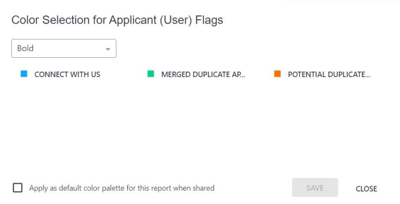
Select Preconfigured Colors
To use a preconfigured color palette:
- Click Color selection from the kebab menu in the upper-right hand corner of the chart, or click the paint palette icon
 . This opens the Color Selection pop-up.
 - Select a color palette from the drop-down.
- Click .
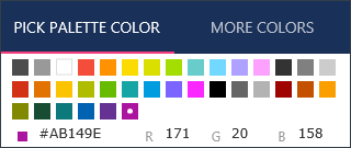
Customize Color Palette
You can customize the colors for every color in your chart. Starting with a preconfigured palette, you can select any of the colors and change them.
To customize a color:
- Click Color selection from the kebab menu in the upper-right hand corner of the chart, or click the paint palette icon . This opens the Color Selection pop-up.
- Click a color. This opens a color palette pop-up.
- From the Pick Palette Color tab, click a preconfigured color in the palette. This automatically closes the color palette pop-up.
- Or, click the More Colors tab and enter the Hex or RGB value. You can also click anywhere in the color box or slide the bar to change the color.
- Check Apply as default color palette for this report when shared to share the selected color palette for the report with shared users. When you select this checkbox, the report owner’s defined chart color palette is only applied to fields in the shared report, and it does not affect shared user’s color preference for the same fields in other reports. If you do not select the checkbox, the shared users will see their own defined colors or the default color assigned by the application.
- Click to save the changes to your colors.
Note:
- The shared color palette for the specific shared report cannot be edited by shared users with view only access.
- The checkbox is visible for all users. Users with edit rights can view and edit the checkbox. Users with view only permissions can only view the checkbox.
Color palettes apply per dimension, per user. For example, if Training Status is your dimension and you change the color palette, once you save the changes, the colors you have chosen for Training Status are saved for your account. The same color palette will now reflect in all of the widgets using Training Status or any new report generated with Training Status. If you then choose a different color palette for Training Status and save, the previously chosen palette will be overwritten with a new one.
Chart Legend/Values
Charts show up to 50 plot points in a one dimension chart and up to 2,500 chart points for a two dimension chart. The chart legend displays to the right of the chart. The legend lists each plot point of the chart in order from highest to lowest value.
Column, Line, and Bar charts that only have one dimension and one measure will not have a legend. Pie charts always have a legend.
You can also view the dimensions and measure name by hovering over the colored section of the chart.
Publish to Dashboards
Charts that are created for a report in Reporting 2.0 can be published as dashboards. See Reporting 2.0 - Publish to Dashboards.
Refresh
When you click to view the chart, a report type pop-up What type of report are you building? may appear, depending on the fields you have included in the report. Select the report type from the drop-down in the pop-up. Then, click . See Reporting 2.0 - Report Types.
The chart preview shows up to 1,000 results. When viewing the chart on the Report Viewer, the chart shows up to 2,000 results.
Note: Chart values always display starting from zero in the user interface. When exporting the chart, the export format adjusts based on the format and data, which could result in starting from a value other than zero.