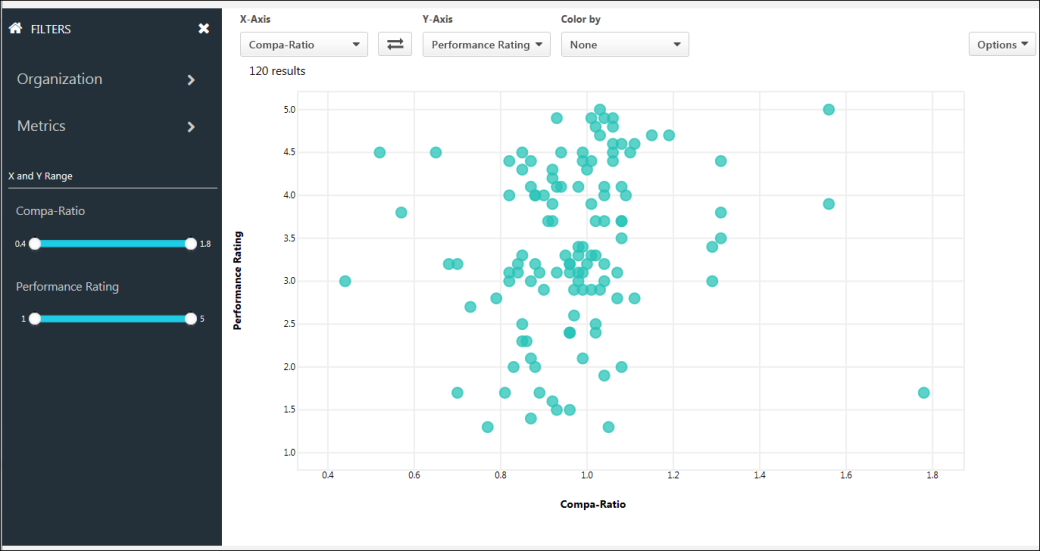
Use the View Data page to compare performance ratings and compa-ratio across the organization. For portals with Succession, you can also compare Succession metrics. The graph can also be colorized to provide a better visual of the various data points.
By default, when accessing the page, the performance ratings and compa-ratio data displays in the scatter graph. This allows you to quickly drill down to the desired data selections, using the filters and colorization tool.
View Data is limited to display up to 5,000 users at any one time. For portals with more than 5,000 users in their data base, only a partial set is displayed. The end user can use filters to see specific segments, as needed.
To access View Data, go to .
Filters
Refine the list of results. The filter options that are available are configured by the administrator in View Data Preferences.
- Open/Close Filters Panel - The Filters panel is expanded by default. To close the panel, click the X in the upper-right corner. To expand the panel, click Open filters panel button
 .
. - Home Button - The Home icon
 in the upper-left corner of the panel returns you to the root level of the filters. Clicking the icon does not reset/clear the filters.
The following filters are available:
Filter by up to seven different parent organizational units (OU) and child OUs. The OUs that are available are configured by the administrator in View Data Preferences.
To filter by OU:
- Click the Organization filter. This opens the list of parent OUs.
- Click the parent OU to view the child OUs.
- Select one of the following options:
- Check the box to the left of the child OU name to select the child OU as a filter.
- Click the child OU to view the additional child OUs. Then, click the name of the additional child OU to set it as a filter.
The graph updates automatically to display matching employees. Repeat these steps to set additional filters. The selected filters display at the bottom of the Filters panel.
Note: Tenure and Merit Increase (%) are added automatically if available and are not user configurable.
This filter allows you to filter by up to five different succession metrics in addition to Tenure and Merit Increase (%). The metrics that are available are configured by the administrator in View Data Preferences.
To filter by succession metric:
- Click the Metrics filter. This opens the list of succession metrics.
- Click a metric to view the available ratings.
- Click a rating to select it as a filter.
Tenure/Metric Increase % Filters
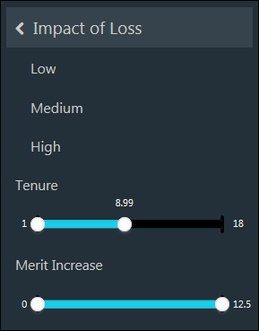
Adjust the tenure and merit increase values for the graph by sliding the bar to the left or right from either side. This updates the graph based on the selected value.
Note: The percent merit increase = compensation increase/base salary (prior to the increase) * 100.
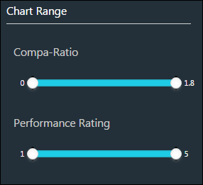
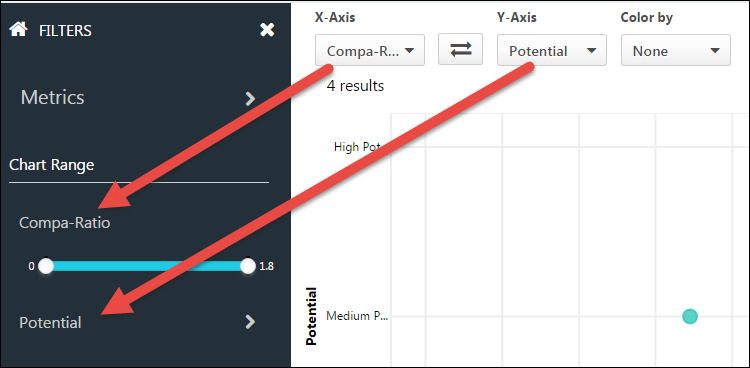
The Chart Range Filters correspond to your X and Y axis selection. By default, the Chart Y Range filters allow you to adjust the compa-ratio and performance rating by sliding the bar to the left or right from either side. This updates the graph based on the selected value. For Succession Metrics, the range filters change to a drop-down.
The range of the slider is determined by the Min and Max range of the population.
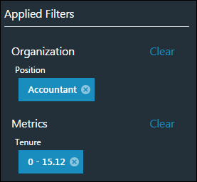
The Applied Filters section only displays after at least one filter is added. This section displays at the bottom of the Filters panel and shows you which filters you have applied to the data.
You can remove an individual filter by clicking the X to the right of the filter.
You can remove all filters in a group by clicking Clear. Note: To remove all the filters that you have set, you can click Clear All at the top of the Applied Filters section.
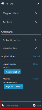
The My Favorites section displays at the bottom of the Filters panel. This section allows you to add up to 20 searches as favorites and view your saved searches.
To add a search as a favorite, click the Add option and name the search, up to 45 characters. This saves the search with all of the filters you have selected in the Filters panel.
To view your favorite searches, click My Favorites. This opens a pop-up that allows you to see a list of your favorites and select the search that you would like to view. You can modify the filters you selected for the saved search, and then save the search again or save it with a different name.
View Data Graph
The scatter graph for View Data displays the interactive visualization of your data based on the selected filters. Up to 5000 employees display.
You can define the X and Y axes, as well as define a colorization for the plot points based on compa-ration, performance rating, or one of the available Succession metrics.
By default, compa-ratio displays as the X axis. In addition to compa-ratio, users will be able to select Tenure and Merit increase (%). For portals with Succession enabled, you can change the X axis to a Succession metric by selecting a metric from the axis drop-down. The graph will update automatically to display the new axis.
By default, performance rating as the Y axis. In addition to Performance ratings, users will be able to select Tenure and Merit increase (%). For portals with Succession enabled, you can change the Y axis to a Succession metric by selecting a metric from the axis drop-down. The graph will update automatically to display the new axis.
Flip Axes
Click the Flip button ![]() to flip the values for the X and Y axes.
to flip the values for the X and Y axes.
Color By
You can define a colorization for the graph to provide a better visual of the data point variations. By default, you can select Compa-Ratio, Performance Rating, Tenure, or Merit Increase % from the Color by drop-down. For portals with Succession, you can also color by the available Succession metrics.
Color Legend
When using a color option, a legend displays to the right of the graph. The legend identifies the value for each color. You can also use the legend as a filter by clicking or unclicking a value on the legend to display or hide the value in the graph.
Discrete/Numeric
Up to nine segments are allowable for discrete values. Numeric values are divided into five equal segments.
Legend Segments
With the exception of Compa-ratio, all non-Succession metrics are uniformly broken up into five segments. The size of the segment is determined by the minimum and maximum range of the entire data set. The size of the segment cannot be configured by the user.
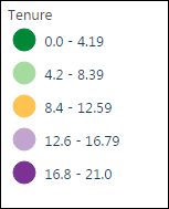
- Minimum Tenure = 0.1
- Maximum Tenure= 21
- Segment Size = (21-0)/5 = 4.2
- Green is always assigned the lowest value, and purple is always assigned the highest value.
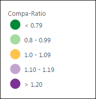
For compa-ration, the breaks are fixed at the following:
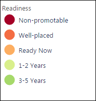
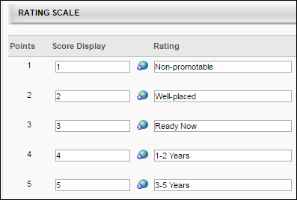
For Succession Metrics, the number of segments is based on metric type. Up to nine segments may be displayed. The color assigned is determined by the points assigned to the metric. Red is always assigned the lowest point rating, and green is assigned to the highest point rating.
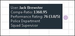
Tooltip
Hover over/tap a plot point to view the details for the particular employee. If the employee in focus shares the same X and Y values with other employees (a complete overlap), the tooltip displays the values for the X and Y axes and a count of the complete overlaps. For all others, the tooltip will always display the user's name and the variable on the X and Y axes for non. The tooltip may also display OU data, if configured by the administrator in View Data Preferences.
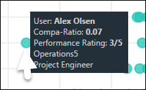
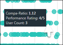
The OU details for a data point are only displayed for non-overlapping data points. If you have overlapping points, View Data only shows the X and Y value, as well as a count of how many points are on the same spot.
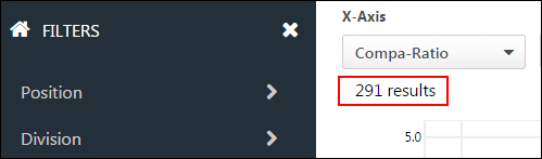
Number of Results
The total number of results on the graph displays in the upper-left corner above the graph. The results will not exceed 5,000 data points.
Performance Rating with Multiple Scales
For portals with performance data with multiple scales, (i.e 5/5 and 10/10), the data is automatically normalized to allow for comparisons. The slider maximum and chart axis are set to between 0 and 100. Normalization is achieved by dividing performance rating score received by the maximum achievable score. This setting is not configurable by the user.
The tooltip displays the current rating and the maximum rating next to the normalized score (e.g., 50 [2.5/5.0]).
Options
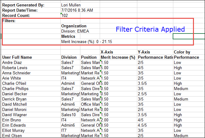
From the Options drop-down, you can click Export to Excel to export the graph to an Excel spreadsheet. This provides a detailed view of the users and their performance, compa-ratio, or Succession data. The filter fields that display on the Excel spread sheet match the fields displayed on the tooltip.