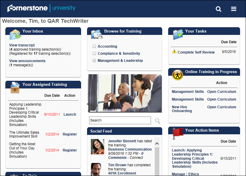
The Responsive Navigation Theme is a display theme that provides a simpler and more intuitive interaction with the system. When a user navigates throughout the application on a mobile, tablet, or desktop browser, the navigation responds to the appropriate browser size and provides the user with an optimal experience on a responsive page.
Themes are configured for a division in Display Preferences. See Display Preferences .
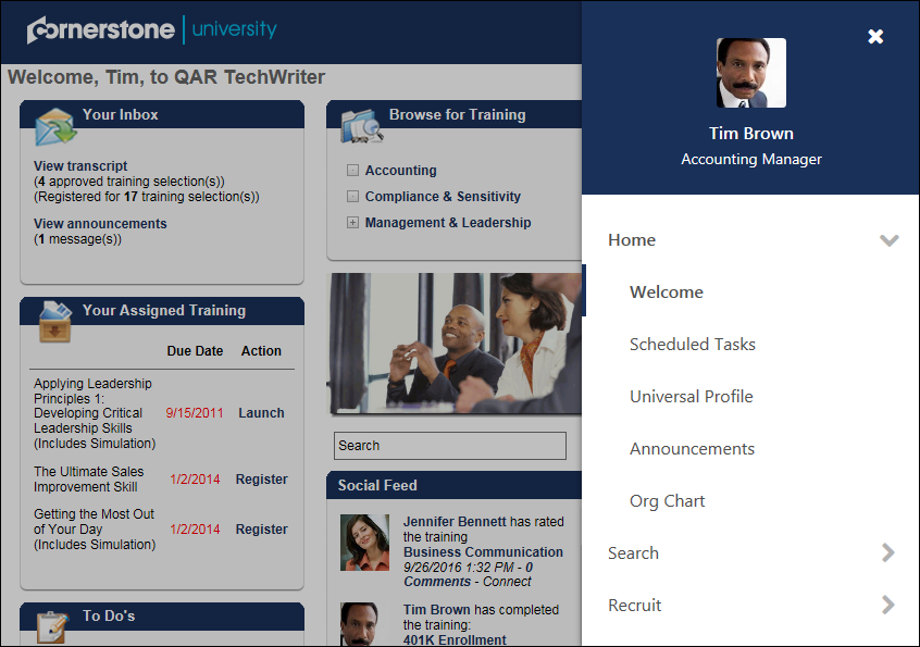
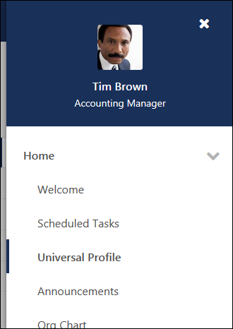
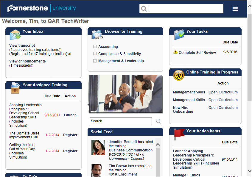
When the Responsive Navigation Theme is enabled, the navigation tabs and links are hidden and can be viewed by selecting the menu icon in the upper-right corner of the page. When the menu icon is selected, the navigation tabs and links display as a fly-out on the right side of the screen that expands vertically.
Users can initiate a global search by selecting the search icon in the upper-right corner of the page.
The My Account, Help, and Log Out options are available at the bottom of the navigation menu.
Default View
Large Screen:
Small Screen:

Expanded Menu View
Large Screen:
Small Screen:
Global Search
Large Screen:
Small Screen: