Display Preferences
Note: When changing the display settings for your portal, it may take a few minutes before the new settings are fully implemented. If the new settings do not take effect after a few minutes, you may need to clear the temporary Internet files for your Internet browser.
To access Display Preferences, go to .
 Permissions
| PERMISSION NAME | PERMISSION DESCRIPTION | CATEGORY |
| Display Preferences - Manage | Grants ability to configure Display Preferences, including Navigation Tab theme and settings and header logo displayed to end users. This is an administrator permission. | Core Administration |
| Display Preferences - Upload Logo | Grants access to upload an image on the Display Preference Page. User must also have Display Preference permission. This is an administrator permission. | Core Administration |
Display Preferences
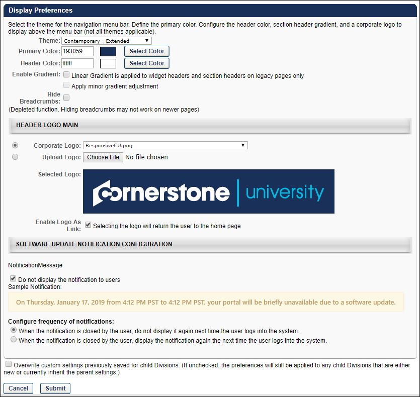
The following options are available:
- Theme - From the drop-down list, select a theme. Themes include Contemporary - Extended, Eggshell - Extended, None - Hide Navigation, and Responsive Navigation. After saving the Display Preferences, you may have to log out and then log back in to the system to view the new settings.
- When the "None - Hide navigation" theme is selected and the preferences are saved, users in the affected OUs can no longer see or access the navigation bar. All of the configurations and settings defined in the Navigation Tabs and Links preferences are ignored and users can only access pages which have links that are available on their Home page.
- Important: When selecting the "None - Hide navigation" theme, it is not recommended to use this option across the entire portal, as it prevents system administrators from accessing many of the administrative features needed for portal configuration. If this occurs, contact Global Customer Support to correct the setting.
- Primary Color - Select the primary color for your portal. The primary color dictates the color of the navigation bar and table headers. You may enter a hex value for the color or select a color by clicking the Select Color button. All styles allow a second color to display above the navigation bar. The default font is Arial.
- Header Color - Select the header color for your portal. You may enter a hex value for the color or select a color by clicking the Select Color button. All styles except the Responsive Navigation theme allow a second color to display above the navigation bar. The default font is Arial. To remove a color from the header space, select the white color.
- Important: When using the Responsive Navigation theme, the Header Color field is not applicable and is hidden.
- Enable Gradient - Linear Gradient is applied to widget headers and section headers on legacy pages only - Select this option to enable a linear gradient to widget headers and section headers. When the color gradient is enabled, colors in the interface transition smoothly. If this option is deselected, the widget headers and section headers are a solid color. This only impacts legacy pages.
- Enable Gradient - Apply minor gradient adjustment - Occasionally, when a linear color gradient is applied (via the above option), the colors may appear a bit distorted. If this occurs, organizations may select this option to adjust the colors so that they appear more aesthetically pleasing.
- Hide Breadcrumbs - Select this option to hide the breadcrumb links from view on older pages. This option does not work on newer pages. The breadcrumbs are the links that appear below the navigation bar and display the breadcrumbs for the current page. You can click the various links within the breadcrumbs to navigate to that page.
Header Logo Main
Select a main header logo for the portal:
- Corporate Logo - From the drop-down list, select a logo that has previously been uploaded.
- When using the Responsive Navigation theme, the recommended image size is 88 x 750 pixels, the minimum image height is 88 pixels, and the maximum image width is 750 pixels.
- Upload Logo - Click to upload a logo image from your computer. After selecting the logo image, click to upload the image to the portal. The maximum file size for logo images is 1 MB, and must be of type .png, .gif, .jpg, or .bmp.
Enable Logo as Link - When this option is selected, the portal logo in the upper-left corner of the page becomes a link to the portal Home page. This logo is always visible to users, so selecting this option provides a convenient way for users to return to the Home page.
- If the "None - Hide navigation" theme is selected for an OU, it is strongly recommended that the header logo be configured as a clickable link, as this enables the user to return to the Welcome page at any time.
Header Logo Icon
When the Theme is set to Responsive Navigation and the Display Preferences are saved, a Header Logo Icon section is available the next time the Display Preferences page is opened. This section enables the administrator to configure the header logo icon that is displayed when the system is viewed on a smaller device, such as a mobile phone. This section contains the same options as the Header Logo Main section. The Header Logo Icon image is displayed when a user is viewing the portal in a browser window that is smaller than 768 pixels wide.
The header icon image must be a square, meaning that the image height must be equal to the image width. The recommended image size is 88 x 88 pixels, and this is also the minimum image height and width.
If no main header logo image is selected and no header icon image is selected in Display Preferences, then the portal name is displayed in place of the logo.
Software Update Notification Configuration
Cornerstone OnDemand can set messages to appear within the portal to directly notify users of upcoming system patches and releases. The message content and duration is controlled by Cornerstone and cannot be customized. Administrators have the ability to configure whether the messages are displayed to users and the frequency of notifications.
- Notifications for release deployments are displayed approximately five days prior to the deployment date.
- Notifications for patch deployments are displayed approximately three days prior to the deployment date.
- Notifications are not displayed for unplanned down time and system maintenance.
The following options are available to configure software update notifications:
- Do not display the notifications to users - This option determines whether or not system update notifications are displayed to users. When this option is selected, software update notifications do not display to users at any time. This option is unchecked by default.
- Configure frequency of notifications - When software update notifications are displayed to users, the notification appears below the navigation tabs and links upon accessing the system, and Cornerstone determines the time at which the notification no longer appears. During the display window, the message continues to appear across pages when the user navigates from one page to another. However, the notification can be closed by the user. This option enables the administrator to configure whether or not the notification appears to the user the next time the user logs in to the system during the display window.
- When the notification is closed by the user, do not display it again next time the user logs into the system - When this option is selected, once the user closes the notification, it no longer appears to the user the next time the user logs in to the system during the display window. However, if any text changes are made to the message after the user closes the notification, then the notification will appear again in the portal.
- When the notification is closed by the user, display the notification again the next time the user logs into the system - When this option is selected, if the user closes the notification, the notification will reappear the next time the user logs in to the system during the display window.
Submit, Cancel, or Restore Defaults
Click to finalize the display preferences, Note: After saving the Display Preferences, you may have to log out and then log back in to the system to view the new settings.
Click to discard any unsaved changes.
Click to restore the default system settings. This does not restore your portal's original display preferences. This button is only available if the Classic navigation theme is selected, which is no longer supported.
Overwrite Settings
Select this option to overwrite custom settings for child division OUs. If you overwrite custom settings for child division OUs, the selected settings are applied to both new and existing child OUs. Any previously customized child OUs are updated with the selected settings.
- If there are no customizations to the child OU, then the parent OU customizations are applied to all child OUs.
- Overwrite custom settings checkbox setting
- If this option is selected, all child OU customizations are deleted from the database, which means the parent OU customizations will be applied to new and existing child OUs.
- If this option is unselected, all existing child OU customizations will remain unchanged, and any new child OUs will inherit the parent OU customizations by default.
- If a child OU has been customized to display any widgets, then regardless of the parent OU customizations, the child OU customizations are applied.
- If a child OU has been customized to hide all widgets, then parent OU customizations will take precedence and will be applied.