Campaign Dashboard
The Campaign Dashboard displays a high-level view of the results of your Satisfaction, Engagement, and Commitment campaigns. A campaign is an engagement survey task which is deployed to users at a frequency and for a duration specified by the administrator who created the campaign. The goal of an engagement campaign is to ascertain employees' feelings toward various aspects of the organization, allowing the organization to gather data which can be used to increase retention, performance, and motivation. There are three types of campaigns:
- Satisfaction - Helps gauge employee satisfaction and predict employee retention
- Engagement - Helps gauge employee engagement and predict employee performance
- Commitment - Helps gauge employees' level of commitment to the organization and predict organizational citizenship behavior, which allows organizations to determine which parts of the company go above and beyond their job descriptions.
To access the Campaign Dashboard, go to .
| PERMISSION NAME | PERMISSION DESCRIPTION | CATEGORY |
Export to Excel
This action allows you to export top-level Engage data from the Campaign Dashboard to an Excel spreadsheet. Data is exported based on the current filters and user permissions. If users do not have permission to view specific data, it is not exported.
To export to Excel, select Options, and then select Export to Excel.
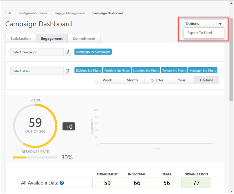
The data is exported to an Excel spreadsheet.

Filters
Using the filters available on the Campaign Dashboard, you can filter the report results by key dimension, organizational unit, and time interval:
- Key Dimension - Using the tabs at the top of the page, you can filter report results by the following key dimensions:
- Satisfaction - Click this tab to view only data related to Satisfaction campaigns (selected by default).
- Engagement - Click this tab to view only data related to Engagement campaigns.
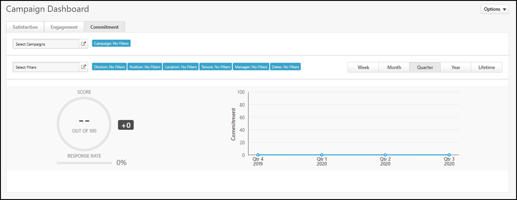
- Commitment - Click this tab to view only data related to Commitment campaigns.
- Select Campaigns - This filter enables you to filter results Created By Me Only or turn filters on or off.
- This filter is only available to administrators who have permission to the Engage - Administration permission.
- When a manager who has the Engage - View permission accesses this page, the Campaign Dashboard displays data from all campaign data that is within the manager's permission constraints.
- Select Filters - This filter enables you to view survey results for users in a specific division, location, employee tenure, position, campaign, manager, or date. Click Select Filters and choose a specific filter from the flyout that appears (all employees selected by default). Note: When using the Manager filter, the following additional filter options are available:
- Direct Reports Only - To limit Engage report widget data to managers' direct reports, toggle the Direct Reports Only switch to the On (blue) position. If this switch is toggled to the Off (gray) position, data is aggregated across all of their direct and indirect reports
- Show Inactive Managers - To include data from inactive managers, toggle the Show Inactive Managers switch to the On (blue) position. If you do not wish to include data from inactive managers, leave this switch toggled to the Off (gray) position.
- Time Interval - Use the tabs above the chart, to filter report results by the following time intervals:
- Week
- Month
- Quarter (selected by default)
- Year
- Lifetime
Note: When an administrator or manager applies filters or makes tab selections on the Campaign Dashboard, these selections are saved for the user when they access the page again in the future. The filter and tab selections are not refreshed when the user navigates away from the page.
Charts
The charts on the Campaign Dashboard provide a graphical representation of the following data for your selected key dimensions, OU criteria, and time interval:
- Score Wheel - This is the average score for all of the selected key dimensions' surveys over the selected time period. For example, if you have selected the Satisfaction tab and left the OU criteria set to all employees, and the Score chart shows a score of 78%, your organization's total average employee satisfaction for all time is 78%. The score can range from 0-100.
- Response Rate - This bar graph displays what percentage of users invited to respond to the campaign's survey actually provided a response.
- Satisfaction/Engagement/Commitment Over Time - This graph displays employees' average satisfaction, engagement, or commitment over time, depending on which key dimension you selected. For example, if you select the Engagement key dimension, leave OU criteria set to all employees, and select the Monthly tab, you can view the average employee engagement for each of the last 12 months. The Lifetime tab aggregates all available results.
Response Heat Map
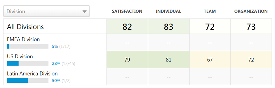
Below the charts, you can view a breakdown of different employee groups, such as different divisions or locations, with more specific response data for those groups. For each employee group, the following columns display with data, if available:
- Demographic name - The name of the employee group, such as division, location, or all employees
- Satisfaction/Engagement/Commitment - The average satisfaction, engagement, or commitment percentage of the group
- Individual/Team/Organization - The average percentage score across driver questions for the individual, team, or organization dimensions. The questions in these driver dimensions are used to provide more context for Satisfaction/Engagement/Commitment data. These scores are not included in the overall score wheel calculation but can help identify outliers and major issues within the organization.
Clicking an organizational unit (OU) allows the administrator to drill down to view child OUs of the parent OU and associated sub scores. Clicking a child division causes the heat map to refresh and display the selected OU as the new parent OU, along with its child OUs and associated scores. Any active filters are retained while navigating the heat map hierarchy.
Heat Map Filters
The Campaign Dashboard heat map allows users with the appropriate permission to view survey response data results by the following criteria:
- Division
- Location
- Position
- Manager
To view heat map results by one of the above criteria, first select one or more Division, Location, or Position filters and click the button. Then click the heat map filter drop-down menu and select the desired filter from the list. For example, if you select the Position filter, heat map results will be displayed by the different positions from which survey results have been received.
Drivers
On the bottom of the Campaign Dashboard, the drivers for the selected key dimenstions display. Drivers are the questions that strongly impact the overall score in the Score Wheel. Driver scores can range from -100 to +100, and affect the strength of the Score Wheel percentage. Engage uses a Kendal rank correlation coefficient, also known as Kendall’s tau coefficient, to calculate the driver score, which can be interpreted as a correlation. Examples:
- A driver score of +100 indicates a perfect positive correlation. As responses to that driver question rise, so does the overall score. The driver and overall score rise and fall together.
- A driver score of -100 indicates a perfect negative correlation. As responses to that driver question rise, the overall score falls. The driver and overall score rise and fall in opposition to one another.
- A driver score of 0 indicates there is no correlation between that driver question and the overall score. An employee’s response to the driver question has no relation to their satisfaction, for example.
To improve the organization's Satisfaction score, focusing on strong drivers (those closest to plus or minus 100) that represent the issues most likely to impact the overall score is recommended. Questions with a low driver score (close to 0) are still worth reviewing, and depending on your company strategy, may warrant a place in action planning. However, initiatives related to weak drivers are less likely to change the overall Satisfaction score.
Driver and Question Navigation
Both the Driver Details section and the Question Details section display all available drivers and questions, respectively. A maximum of six drivers can display at a time in the Driver Details section, and a maximum of six questions can display at a time in the Question Details section. To view specific pages of results, click the page numbers that display in the bottom-right corner of the relevant section. To navigate to the first page of results, click the left-facing double arrow icon. To navigate to the last page of results, click the right-facing double arrow icon. The single arrow icons can be used to page chronologically back and forward through pages of search results.
Drivers are sorted by highest-scoring. Questions are sorted by most-answered.
Clicking on a driver navigates you to the Driver Details page for the driver, allowing you to analyze the driver in greater detail. See Driver Details.
Clicking on a question navigates you to the Question Details page for the question, allowing you to analyze the driver in greater detail.
Drivers vs. Questions
Drivers are scored questions that are included in the driver analysis to determine which themes are correlated with overall Satisfaction, Engagement, or Commitment. Scored questions in any driver dimension (e.g. the Individual, Team, or Organization dimensions) will automatically be included in driver analysis.
Questions can be either free-text, open-ended questions that do not have a score, or they can be scored questions from one of the primary Satisfaction, Engagement, or Commitment dimensions. Satisfaction, Engagement, and Commitment questions are always excluded.