Learner Home Preferences
On the Learner Home Preferences page, administrators can set the display order of Learner Home content and add custom banners and cover images to the Learner Home page. Learner Home Preferences are set by division.
To access Learner Home Preferences, go to . Select the division for which you want to configure preferences.
Note: It is possible to set Learner Home preferences by an organizational unit (OU) other than division, but this is not self-configurable. Contact Global Customer Support to set Learner Home preferences using a different OU type, such as Position, Location, etc.
 Permissions
| PERMISSION NAME | PERMISSION DESCRIPTION | CATEGORY |
Cover Image Configuration
To upload a cover image for the Learner Home page:
- Drag and drop your prepared image file into the image upload zone in the Cover Image Configuration section, or click the button and search for and select the image file from your computer.
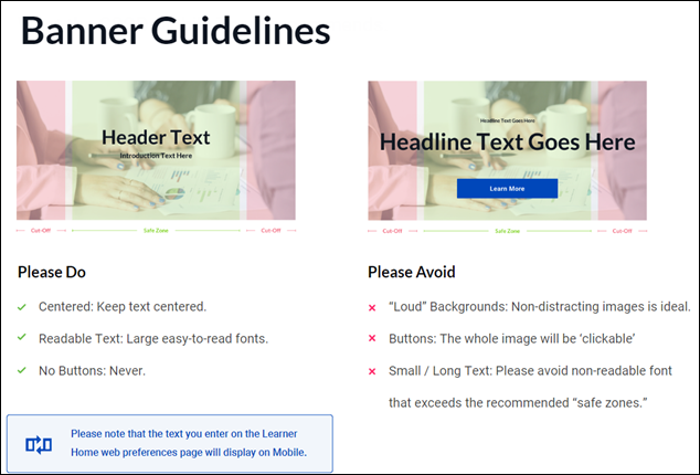
- When the image finishes uploading, the file name displays in the Cover Image Configuration section with a thumbnail version of the image. To preview the image as it will appear on the Learner Home page, click the See Preview link. Note: The image preview only displays the image based on the recommended dimensions of 1920 x 130. The uploaded image is NOT cropped to fit Learner Home. To ensure proper fit, it is necessary to upload a custom cover image that meets the system's recommended dimensions.
- The Content Image Configuration section refreshes to display a full size version of the uploaded image. Review the image to ensure it displays as expected. If the image does not appear as desired, you can click the Reset link above the image preview, which restores the Cover Image Configuration section to default settings.
- Once the cover image displays as expected, click the button at the bottom of the Learner Home Preferences page.
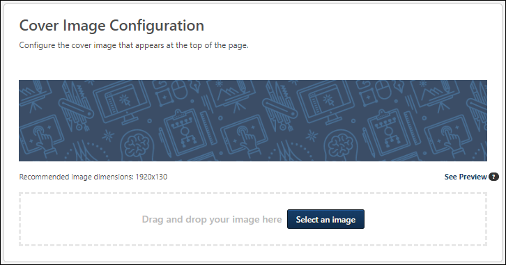
Image Specifications
The following image specifications apply to cover images:
- Supported file types: bmp, gif, jpg, jpeg, png
- Maximum file size: 5 MB
- Recommended Dimensions: 1920x130
- Note: These dimensions provide the best balance between image resolution and size. Depending on browser window size and screen resolution, the image may not span the entirety of the page.
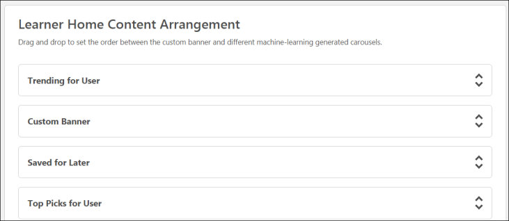
Learner Home Content Arrangement
In the Learner Home Content Arrangement section, you can rename, rearrange, and deactivate content carousels, if needed. The sections you can configure include:
- Custom Banner
- Continue Learning
- Saved for Later
- Top Picks for User
- Trending for User
- Inspired by Your Subjects
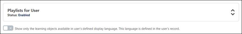
- Playlists for User
- Most Popular
- Featured
- Suggested
- Required
- Based on Skills You Want to Develop
- Based on Your Critical Skills
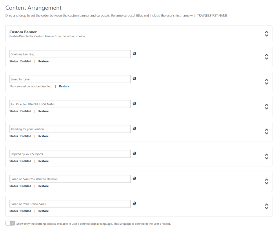
Rename Carousels
To change the header name of a training carousel:
- Place your cursor in the text field for a carousel.
- Enter an alternate carousel name. Names are limited to 40 characters.
- Click the button at the bottom of the Learner Home Preferences page to ensure your updates to preferences are saved and applied.
To revert an altered carousel name back to its default name, you can click the Restore link. The Restore link is only available for carousels with customized names or translations.
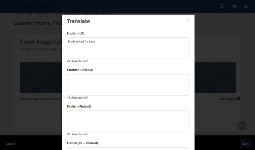
To localize a carousel name into other languages:
- Click the Globe icon next to the carousel name. This opens the Rename Carousel pop-up window.
- Enter an alternate carousel name for any language enabled in your portal. Names are limited to 40 characters.
- Click the button in the pop-up.
- Click the button at the bottom of the Learner Home Preferences page to ensure your updates to preferences are saved and applied.
The alternate names you have provided will display to users on Learner Home if you provided an alternate name in the user's display language.
Considerations
The following tag can be used in carousel names:
- [TRAINEE.FIRST.NAME]
Using this tag causes the system to insert the user's first name into the carousel title. No other tags can be used with carousel headers.
Example: "Suggestions for [TRAINEE.FIRST.NAME]" becomes" "Suggestions for Jon" when the carousel is viewed by a user named Jon.
Enable/Disable Carousels
Below each carousel title, a Status field displays, alerting the administrator to whether the carousel is enabled or disabled.
- If the Enabled link displays as a carousel's status, the carousel is active on the Learner Home, and if needed you can click the Enabled link to disable the carousel. The link then changes to Disabled.
- If the Disabled link displays as a carousel's status, the carousel is NOT active on the Learner Home, and if needed you can click the Disabled link to enable the carousel. The link then changes to Enabled.
Note: The Saved for Later section cannot be disabled.
Display Language toggle
This option allows administrators to configure the Learner Home page to only show content available in the user's display language. To prevent users from being recommended training that is not available in their display language, toggle this switch to the On (green) position. If this toggle is in the Off position, users may see training available in other languages in their Learner Home carousels.
The Display Language option does not apply to the training recommendations contained within the following Learner Home carousels:
- Continue Learning
- Saved for Later
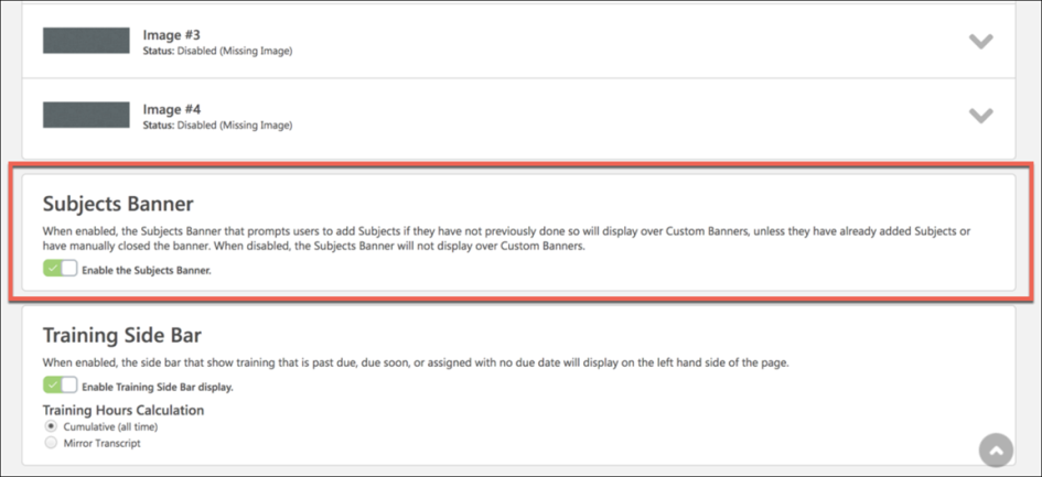
Enable or Disable Subjects Banner
To disable the Subjects banner and prevent it from displaying to users on the Learner Home page, toggle the Subjects Banner switch to the Off position. The Subjects banner is enabled by default but can be deactivated at any time. If an administrator re-enables the Subjects banner after it has been disabled, users will again see the Subjects banner on their Learner Home page unless the user has already added subjects or has previously dismissed the Subjects banner by clicking the X icon within the banner.
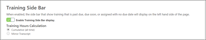
Enable Training Side Bar
The Training Side Bar is the portion of Learner Home which displays information about training that is past due, due soon, and assigned on a user's transcript. To disable the training side bar for both the web and mobile version of Learner Home, toggle the Enable Training Side Bar switch to the Off position. To enable the training sidebar, toggle the Enable Training Side Bar option to the On position.
If the training sidebar is enabled, the following Training Hours Calculation options are available:
- Cumulative (all time) - Training hours will be calculated based on the training completed on a user's transcript for all time.
- Mirror Transcript - Training hours will be calculated the same way as the training hours are calculated on the user's transcript, which is often based on the portal's fiscal year settings.
Save
To rearrange the display order of the different sections, you can click and drag any section to a new place in the order. You MUST click the button at the bottom of the browser window to save any changes you have made to this section before navigating away from the page.
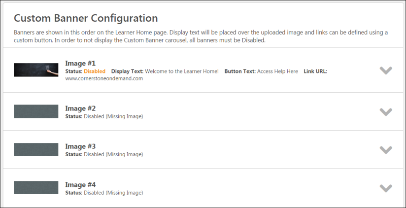
Custom Banner Configuration
In the Custom Banner Configuration section, you can upload up to four banner images which will be rotated in the Learner Home banner carousel. Each of the banner images displays in a drop-down with the following information:
- Thumbnail preview image - A small version of the uploaded banner image displays, if a banner image has been uploaded.
- Image Number - This field displays the banner number. Up to four banner images can be displayed in the banner carousel.
- Status - This field displays whether the banner image is enabled or disabled. If no image has been uploaded, or the administrator does not want to show the configured banner in the carousel, the banner's status is Disabled. If the banner has been configured for the carousel and the admin wants to show it in the carousel, its status is Enabled. Clicking on the Enabled or Disabled status allows the administrator to toggle between the two options.
- Display Text - This field only displays if the Enable Display Text option was enabled for the image. If enabled, this field shows the display text entered for the image.
- Button Text - This field only displays if the Enable Action Button option was enabled for the image. If enabled, this field shows the button text provided for the button.
- Link URL - This field only displays if the Enable Action Button option was enabled for the image. If enabled, this field shows the URL provided for the button.
Configure Banner
To configure a banner image for the carousel:
- Click the Expand icon for one of the image drop-downs. You can either change an existing image or expand a drop-down for a disabled image to add a new image to the carousel.
- For each banner image, you may upload three different versions of the image:
- Default - The first image is the default image that is displayed on standard screen sizes.
- Mobile (Portrait) - This image is displayed in Cornerstone Learn on phones and tablets in portrait mode. If no image is uploaded in this section, then the web default banner image is displayed in the Cornerstone Learn app on mobile phones.
- Mobile (Landscape) - This image is displayed in Cornerstone Learn on tablets in landscape mode. If no image is uploaded in this section, then the web default banner image is displayed in the Cornerstone Learn app on mobile phones.
- Either click the button and choose a banner image from your computer, or drag and drop a banner image from your computer desktop into the uploading zone. After the image uploads, a thumbnail version of the image appears above the uploading zone. If needed, you can click the Delete icon next to the thumbnail to remove the image and upload a new one. The following specifications apply:
- Recommended image dimensions:
- Default - 915x280 (if using an image with padding) or 814 x 280 (if using an image with NO padding)
- Mobile (Portrait) - 750x560
- Mobile (Landscape) - 1640x570
- Supported image file types: bmp, gif, jpg, jpeg, png
- Maximum image file size: 5MB
- Recommended image dimensions:
- If desired, you can add additional features to the banner image. Available features you can add to the banner image include:
- Enable Display Text - Check this box to add text that will display over the banner image in the Learner Home banner carousel. When the box is checked, you can enter text into the text field. There is a limit of 140 characters for this field.
- Enable Action Button - Check this box to add a button to the banner that will navigate users to a system location of your choice when clicked. When the box is checked, you can enter button text in the text field and provide a link to the page users will be navigated if they click the button. The button text is limited to 20 characters. For example, to allow users to navigate quickly to their learning transcript, you could create an action button for the banner using text that says "My Transcript" and the URL for the learning transcript page. When the Action Button is enabled, the following options are also available:
- Use Entire Image as Link - Check the Use entire image as link option to make the entire uploaded banner image function as a link for users. When this option is selected, if a user clicks anywhere on the banner image, they will be navigated to the URL provided in the URL field.
- Open Link in New Window - If you would like the button to open the link for a page in a new window instead of navigating the user to the page using the current browser window, you can check the Open Link in New Window option.
Note: The text and button for the banner images do not support localization.
- Click the See Preview link to preview the banner as it will appear on the Learner Home page. Note: Any configured display text and action button will not be shown in this preview and can only be previewed via the Learner Home page.
- Configure up to four banner images for the Learner Home banner carousel. After configuring the Learner Home banner images for the selected division, you MUST click the button at the bottom of the browser window to save any changes you have made to this section before navigating away from the page.
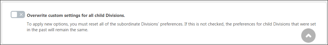
Overwrite Custom Settings
Choose whether or not to enable the setting to overwrite custom settings for child division organizational units (OUs). If you choose to overwrite custom settings for child division OUs, the selected settings are applied to both new and existing child OUs. Any previously customized child OUs are updated with the selected settings.
- If this option is toggled to the On position, then only the child OUs that do not have customized settings will be updated, as well as any OUs that are added in the future.
- A child OU that has not been customized always inherits from the parent, regardless of whether this option is selected.
- An OU is considered customized if its preferences or settings have been changed.
Save or Cancel
To save any changes made to this preferences page, you MUST click the button at the bottom of the browser window. To leave this page without saving any changes, you can either click or navigate away from the page.