The view settings on the left side of the Helicopter View determine the information that is displayed within the grid.
Note: The maximum number of users that can be displayed in Helicopter View is 600.
To access the Helicopter View page, go to .
 Permissions
| PERMISSION NAME | PERMISSION DESCRIPTION | CATEGORY |
| SMP Helicopter Task Calibration | Allows users to view and calibrate succession data from a task within the Helicopter View. This permission can be constrained by OU, User's OU, User, User Self and Subordinates, and User's Direct Subordinates. The constraints that are applied to this permission determine whose data can be viewed and calibrated within the Helicopter View. This is an administrator or manager permission. | Talent/Succession |
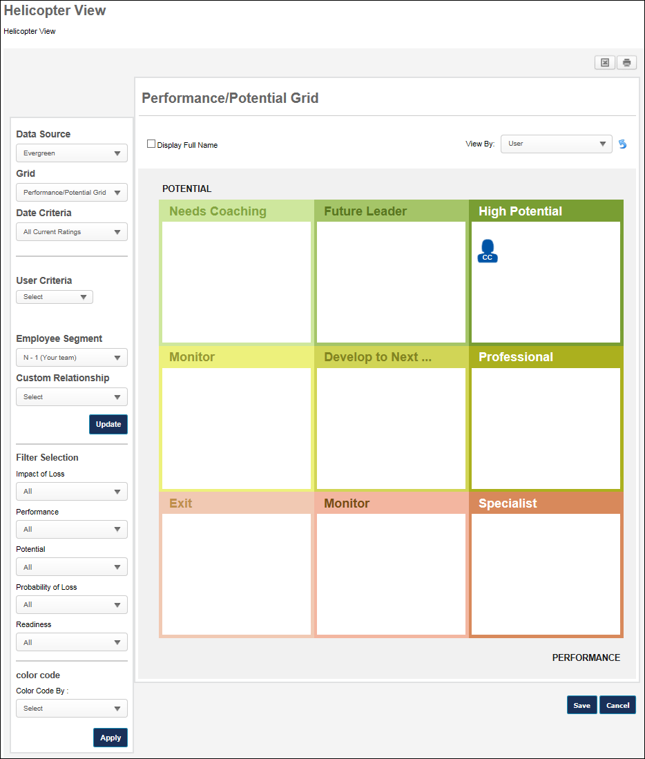
Data Source
The Helicopter View enables administrators and managers to view and calibrate Evergreen data or data from a specific succession task. The Data Source drop-down menu enables the user to select which data is displayed and calibrated in the Helicopter View.
The following options may be available from the drop-down menu:
- Evergreen - This option is selected by default. When this option is selected, the Helicopter View displays the selected users' most recent succession data that is available to the logged in user. This may include data from multiple sources, such as succession tasks and Succession Snapshot. When this option is selected and a user's grid placements are calibrated, the user's Evergreen ratings are updated and no succession tasks are impacted. This option is only available if the user has the SMP Helicopter Evergreen Calibration permission.
- Succession Tasks - The drop-down includes all active, non-expired succession tasks that are available to the user and are configured to allow users to calibrate the task ratings from the Helicopter View. When a succession task is selected, all filters are applied and the Helicopter View displays the selected users' ratings from the selected task. When a task is selected and a user's grid placements are calibrated, the rating changes are applied back to the task to update the user's grid placements and underlying ratings. This option is only available if the user has the SMP Helicopter Task Calibration permission. Note: The user who is viewing the Helicopter View is never visible in the grid. Also, anyone in their manager chain is never visible in the grid.
Grid
The Grid drop-down list enables users to select the metric grid that displays.
- By default, when a manager opens the Helicopter View page, the first grid (alphabetically) is displayed with the manager's direct reports plotted on the grid.
- By default, when an administrator opens the Helicopter View page, the first grid (alphabetically) is selected, but nothing appears on the grid until the User Criteria is set.
-
When a succession task is selected from the Data Source menu, the Grid filter includes all grids from the selected task that are available to the user.
Date Criteria
The Date Criteria drop-down list enables users to define the date range that is used to gather data for the grid. The system uses ratings or grid placements from the selected date range. All date criteria options are in relation to the current date.
When a succession task is selected from the Data Source menu, the Date Criteria filter is hidden because it is not applicable to the data.
A user appears in the grid if they have at least one rating value that was updated within the defined date criteria. The date on which a user's other ratings were updated does not disqualify them from the grid as long as at least one was updated within the date criteria. For example, if the date criteria is set to This Year, the system displays all users within the user criteria that have a grid placement or at least one rating value updated in the past 12 months.
User Criteria
The User Criteria field enables users to define the users that appear in the grid.
This option is only available to administrators and it allows administrators to select an OU or specific users to display in the grid. From the drop-down, select Users or the appropriate OU type. Then, click the Select icon  to select the appropriate users or OU. The selected criteria appears below the User Criteria field. Select the Include Subordinates option to include subordinate users or OUs in the grid. Click to update the grid with the selected user criteria. Note: The available users, OUs, and OU types are determined by the administrator's permissions and constraints.
Note: The maximum number of users that can be displayed in Helicopter View is 600.
Employee Segment
The Employee Segment filter enables the manager to determine which segment of subordinates is displayed in the grid. The N - X values refer to different levels of subordinates.
The following options may be available from the drop-down menu:
- All - This option displays all available users.
- N - 1 (Your team) - This option is selected by default and displays only the first level of subordinates relative to the manager, which is the manager's direct subordinates. This option replaces the previously existing Your Team radio button.
- N - 2, 3, 4, 5 - These options display specific levels of subordinates relative to the manager. For example, N - 2 displays only the direct subordinates of the manager's direct subordinates. N - 3 would display the direct subordinates of the N - 2 segment.
This filter only displays options that have users associated with them. For example, if the manager only has two levels of subordinates, then only N - 1 and N - 2 are available.
Custom Relationship
The Custom Relationship filter enables the user to display only users within a certain custom relationship in the grid. For example, if a user selects the "HR Business Partner" custom relationship, then the grid only displays users for whom the acting user is an HR Business Partner.
Only active custom relationships are displayed in the drop-down menu.
Filter and Color Code Options
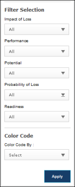
Filters
The Filters section enables users to filter the employees that are visible in the grid. The following filters are available in the Filters section:
Trend
The Trend filter enables users to filter employees based upon their grid placement history. The user must click after selecting a trend to apply the filter to the grid. Note: This filter is only available if the Use Default Trend option is selected for the metric grid field in Custom Field Administration.
All trends are evaluated with regards to their last update.
The following trend options are available:
- Growing
 - This trend displays all employees who have moved directly right one or more cells.
 - Blossoming
 - This trend displays all employees who have moved diagonally up and to the right one or more cells.
 - Leaping
 - This trend displays all employees who have moved directly up one or more cells.
 - Focused on Performance - This trend displays all employees who have moved diagonally up and to the left one or more cells.
- Disappearing
 - This trend displays all employees who have moved directly left one or more cells.
 - Diving
 - This trend displays all employees who have moved diagonally down and to the left one or more cells.
 - Dropping
 - This trend displays all employees who have moved directly down one or more cells.
 - Focused on Potential
 - This trend displays all employees who have moved diagonally down and to the right one or more cells.
 - Static
 - This trend displays all employees who have not moved.
 - No History
 - This trend displays all employees who do not have a previous grid placement.
Metric Rating Filters
A multi-select filter appears for each metric rating (e.g., Impact of Loss, Performance, Readiness) that is configured in My Team Preferences. Note: Metric rating filters only appear in this section if configured in My Team Preferences. The metric rating filters are multi-select, allowing the user to select one or more rating values. In addition to the metric rating values, the user can select the following options:
- No Rating - This option includes employees that have not been rated.
- All - This option includes all metric rating values as well as the No Rating value.
The user must click after selecting a filter option to apply the filter to the grid.
Color Code
The Color Code field enables the user to color code the employee icons within the grid based upon trends, rating scale metrics, or metric grids. Only one color code can be applied.
- Trend - This option color codes the employee icons according to their grid placement trend. Note: This option is only available if the Use Default Trend option is selected for the metric grid field in Custom Field Administration.
- Metric Rating Values - If a metric rating is selected, the employee icon colors are determined by the color attributed to the rating, as defined within Custom Field Administration. If there is no color attributed to a value, the value is displayed in blue. Note: This option is only available if at least one metric rating is configured in My Team Preferences.
- Metric Grid Values - If a metric grid is selected, the employee icon colors are determined by the color attributed to the grid cell, as defined within Custom Field Administration. If there is no color attributed to a cell, the value is displayed in blue. If custom colors are not defined for any portion of the metric grid, that portion uses the default color scheme.
A color key is displayed below the selected Color Code section.
The user must click after selecting a color code option to apply the color code to the grid.