Tenure - Segments
The Tenure segments page displays two different charts:
- Segment Data
- Medians of Portals
In addition to the charts described on this page, each metric's Segments page allows you to view and configure verticals and view metric details. See Benchmark Segments Overview.
To access the Tenure segments page, go to and click the Tenure report widget.
| PERMISSION NAME | PERMISSION DESCRIPTION | CATEGORY |
| Benchmark Total Access | This permission provides total access to the Benchmark metrics and functionality. | Benchmark - Administration |
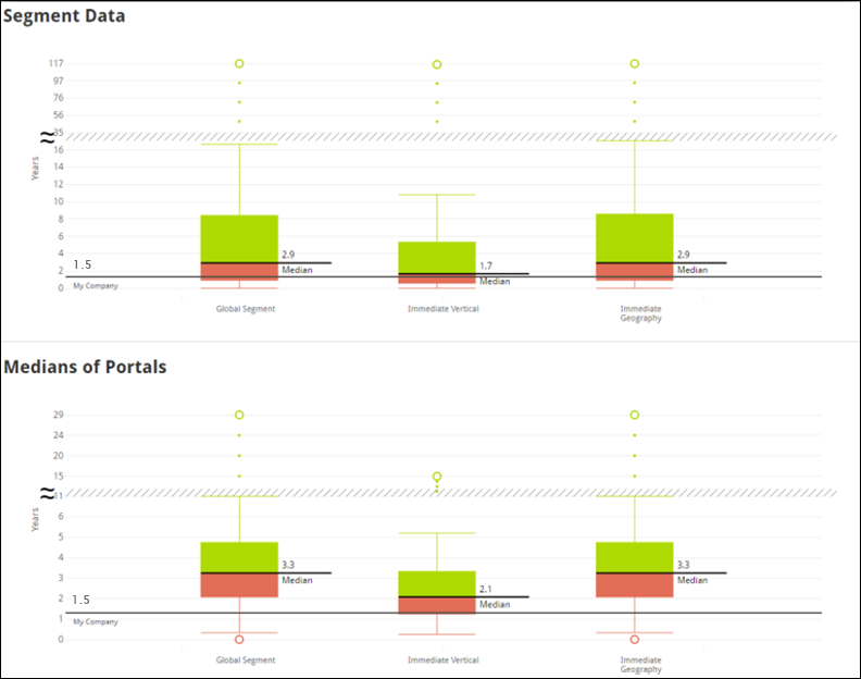
Segment Data
The Segment Data chart displays the median number of years employees stay with an organization. The Median line is the median number of years for all organizations’ users within the segment. The stripe through the middle of the chart is the Scale Break. The Scale Break appears when the values on the Y-axis are increasing, denoting a break in continuity. The circle at the top of the chart displays the Outlier Max Value, which is the highest value for the segment. For Tenure, the Outlier Max Value would be highest number of years for one organization, within the segment.
Medians of Portals
The Medians of Portals chart provides helpful data when there are portals in the Segment Data chart that might be skewing the data. For example, if there is a segment with five organizations, and four out of the five organizations has a median employee tenure of three years, and one of the five organizations has many more users than the others and also has a median employee tenure of 20, the larger organization may skew the data for a segment. To avoid potentially skewed data, the Medians of Portals chart uses the median tenures of each portal, rather than the tenures of all users in the entire segment. By using the Medians of Portals, you can avoid potentially skewed data, since it displays the medians of medians.