Applicant Source - Segments
The Applicant Source segments page displays three different charts:
- Segment Data
- Historical Segment Data
- Averages of Portals
In addition to the charts described on this page, each metric's Segments page allows you to view and configure verticals and view metric details. See Benchmark Segments Overview.
To access the Applicant Source segments page, go to and click the Applicant Source report widget.
| PERMISSION NAME | PERMISSION DESCRIPTION | CATEGORY |
| Benchmark Total Access | This permission provides total access to the Benchmark metrics and functionality. | Benchmark - Administration |
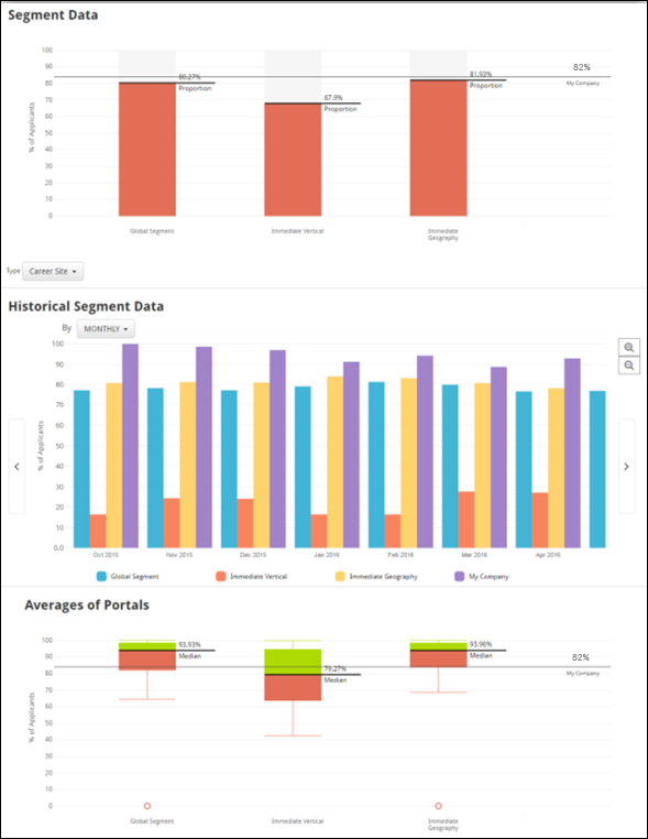
Segment Data
The Segment Data bar chart displays the percentage of applicants for the source type selected, by segment. The My Company line displays where your organization stands amongst its peers. The Proportion line analyzes the entire distribution’s proportion based on the selected source type. For example, if the Career Site source is selected, and the proportion calculation is 80%, this means that 80% of applicants for that segment apply through the Career Site.
To select a source type, click the Type drop-down menu below the Segment Data chart and choose a source from the list. The chart data will refresh accordingly.
Historical Segment Data
The Historical Segment Data bar chart displays the percentage of applicants by segment, for the selected source type, by the selected time interval. This is the same data displayed in the Segment Data chart above, except the Historical Segment Data chart shows how the data across segments has changed over time.
To change the time interval for the chart, click the By: drop-down menu and choose from the following time intervals:
- Month
- Quarter
- Year
After selecting a new time interval, the chart data will refresh accordingly.
Averages of Portals
The Average of Portals plot provides helpful data when there are portals in the Segment Data chart that might be skewing the data. For example, if there is a segment with five organizations, and four out of the five organizations display an average 40% of applicants applying from a Career Site, and one of the five has many more applicants than the others and shows an average of 85% applying from the Career Site, the organization with 85% of applicants from the Career Site may skew the data. To avoid potentially skewed data, the Averages of Portals graph uses the applicant source percentage of each portal, rather than the applicant source percentage from all applicants in the entire segment. By using the Averages of Portals chart, you can avoid potentially skewed data by viewing the average of averages.